Use analyze data to generate charts and metrics
Access analyze data
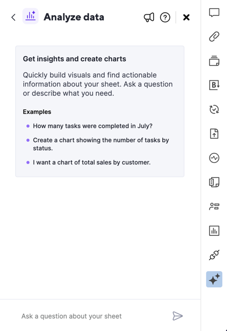
To access the Analyze data panel, you should:
- Go to any sheet and select the Generate with AI tools icon in the right rail.
- Select Analyze data from the list of tools available.
- Ensure you saved your changes, if you made any.
- Type your question or request into the prompt box that appears. Be clear about the output or result you expect. As you type, you can see sample prompts for your reference.
- Alternatively, type in Suggest a question if you want to access sample questions specific to your sheet.
How to interact with analyze data
You can ask all your questions and make modifications in plain language. If the system needs clarification, it asks for it. You can reply in plain language.
If you feel the answers you’re getting aren’t what you expected, ask follow-up questions to refine the answers.
Ask questions that result in a single value output, such as What’s the total budget for the IT Department?
You can also visualize data as bar, line, or pie charts. To do so, ask our analyze data tool questions like Show me the budget across all departments or How many tasks is Person A assigned to?
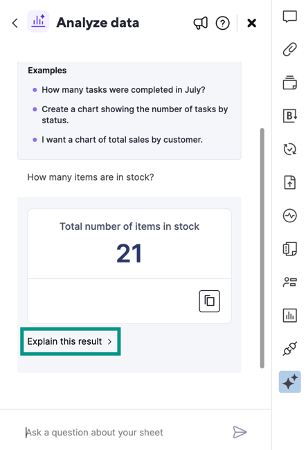
If you ask analyze data to create a chart or metric, use the Explain this result button to access a step-by-step explanation of how the skill generated the response.
Sample questions
Use the following examples to get an idea of the types of questions you can ask analyze data.
Metrics
- How many issues are at risk?
- What’s the average cost of goods made in the USA?
- Who is the contact person for Project Acme?
Charts
- Compare the percentage of tickets for each assignee
- Show me a chart with the breakdown of tickets that started on each date
- Create a chart showing the number of tasks in each status
You can ask analyze data to create a pie, bar, stacked bar, or line chart.
Counts, percentages, and other requests
- How many tickets are assigned to Ariel?
- What percentage of issues submitted this month are complete?
- How many checked rows have three stars? (Applies if stars is a value in a symbol column)
Share the generated answers as an image
You can share your generated chart or metric in two ways:
- Download as an image
- Copy to clipboard
Download as an image
To download your chart or metric as a png file, select the Download icon.
You see the message Image downloaded once the download is successful.
Copy to clipboard
You can copy your chart or metric as an image and paste it into a Slack message, email, slide, document, and more.
Copying a chart or metric as an image doesn’t mean that you can paste it as a live widget. You can only use the Copy to clipboard button to copy a static image.
To do so, select the Copy to clipboard icon to copy the image onto your clipboard.
You see the message Copied! when copy is successful.
Analyze data limitations
At the moment, analyze data can’t provide:
- Summaries, such as asking to Summarize this sheet
- Answers for the Auto-number and Duration column types, and for the duration between two Date columns
- Options to filter or highlight rows
- Add answers to a dashboard

