Applies to
- Brandfolder
Capabilities
Who can use this capability
Admins and Designers can build drag-and-drop templates.
Build drag and drop templates
Drag and drop templates empower users with any level of design skill to create and publish their creative templates in a fraction of the time.
Before you start
- Drag and drop is linked to your brand system. Therefore, all your defined logos, colors, and typefaces can be used
- Drag and drop is still maturing as a technology and does not support:
- Advanced input types including repeatable and dynamic content.
Building your template
Creation
- Navigate to the left-hand side menu and select Templating.
- On the Templates page, select + New Template.
- Choose the Build your own option.
Duplicate an existing template
You can duplicate an existing drag and drop or coded template. In the template library, locate the template, then select the ellipses menu on the right and select Duplicate. Enter a name for the new template, then select Duplicate. The entire template including all variations, designs, content, input, and teams are duplicated. The Published status is not duplicated, so you can make any required changes before publishing.
InDesign templates cannot be duplicated.
Navigating the template editor
Once you create your template, you will see the template editor. It is split into 4 main components.
- Layers/Inputs (objects) sidebar: on the left-hand side.
- Variations/layers: Builders can define one or many Variations with many object layers.
- Inputs: Allows builders to define areas of customization for end users.
- Canvas: in the center, this area is where you can build your template. Currently, it only displays one layout at a time.
- Toolbar: across the top, it includes your tools, zoom control, and save control.
- Attributes sidebar: on the right-hand side, it allows you to customize the attributes of a specific object layer (ie. colors, text, size/position).
Variations
A new template will always have a default variation, of a square Instagram tile. You can create a new one or edit the existing one.

Create a new template
- In the Build your own option, select Create new
- Name your template and select the format.
- Choose from suggested formats, or you can create your own.
- If you choose a pdf format, you can set up professional print settings and increase the number of pages.
- Select Create template.
Create new variations
- Select + New variation in the Objects sidebar.
- Choose from the list of predefined layout options or define a custom size and name.
- If desired, toggle on Enable professional print and adjust the bleed size.
- Select Create.
Edit an existing variation
- Hover over the existing variation via the Layers panel in the Objects sidebar.
- Select the kebab menu.
- Select Edit.
- Adjust the name and the values and select Edit Variation.
Delete a variation
- From the same menu as above, select Delete Variation.
Professional Print
When you enable professional print rendering on a variation:
- Professional print adds bleed space. You can edit the amount in mm on the top, bottom, right, and left.
- Professional print will add crop (trim) marks to the PDF upon exporting it.
- Color space converts to CMYK.
- The PDF packages on export, including images and fonts.
- Pressing the W key on your keyboard shows/hides the bleed and page overflow
Add pages
Additional pages can be added to variations with a PDF format. Select + New page in the objects sidebar.
Variations with PNG or JPG formats cannot have multiple pages. When creating a new variation, and copying the design from a multi-page PDF variation, only the first page will be copied.
Template and variation limits
Drag and Drop templates can be up to 30 pages per variation and have a total of 200 pages across multiple variations. The number of variations in a single template cannot exceed 30.
Building your template
Reference artwork
Adding reference artwork allows you to include a transparent version of your artwork to easily reference while you rebuild your template.
- Navigate to the attribute's sidebar on the right-hand side.
- Toggle on Reference Artwork.
- Choose Select Artwork.
- Select the asset you want to use as your reference.
- Build your template components using the toolbar.
The toolbar
Once you have set up your canvas size, you can start building your template by using the toolbar.
Text (T)
- Select the T icon from the toolbar or use the hotkey (T).
- Select and drag on the canvas or click anywhere on the canvas.
- Adjust the size of the text box by selecting the edge and dragging, or use the transform tool.
The attribute's sidebar on the right-hand side includes:
- Size and position
- Text Content
- Font Settings including font family, weight, size, and line height
- Font Color
- Formatted Lists: ordered lists and bullet points
- Alignment: horizontal and vertical alignment
- Clear Formatting
- Overset Text Warning: This tells the end user that this text box can only accept text content for the allotted size of the text box. It produces an error message, and the text box will turn red.
Integrations and Options
- Brand system: Any configured typefaces will automatically pull into the template editor and be available for font family and weight selection
- Google Fonts: The template editor is integrated with Google Fonts. To configure Google Fonts, select the settings cog and toggle on Allow Google Fonts.
- Inputs: Custom template inputs can be defined on text objects via the Command icon
next to Text and Font styles in the attribute panel.
- Currently, inputs can be configured on the Text content and Font size attributes
- You can have up to 50 inputs in a single template, even if they are used in multiple variations.
Rectangle (R) / circle (O)
- Select the rectangle or circle tool icon from the toolbar or use the hotkeys (R) or (O).
- Select and drag on the canvas to create your shape.
- For a perfect square or circle, click on the canvas.
- Resize by selecting the edge and dragging or using the transform tool.
The attribute's sidebar on the right-hand side includes
- Size and position
- Fill
- Stroke
Image (I)
- Select the image icon from the toolbar or use the hotkey (I).
- Select and drag on the canvas to create your image container.
- Once an initial container is created the Content Automation asset library will appear.
- Select your image. You will need to add new images to the asset library, new images can't be added here.
Image fitting
You can define how your image should fit in your container with the following options:
- Fit: Contains the whole image in the container (this may create blank space if the container is in a different aspect ratio to the image). This is ideal for product imagery, icons, and logos.
- Fill: Fills the whole container with the image.
- Crop: Double-clicking on the image will allow a user to reposition the image in the container or adjust the size of the image container to exactly what they want.
- To enter crop mode: double-click on the image.
- To exit crop mode: Select enter or click outside the image.
Masking an image
You can mask images to specific shapes.
- Create a shape.
- Create an image over the top of the mask.
- Select both layers.
- Right-click on them and select Convert to Mask.
- This will create a mask group.
Integrations and options
- Inputs: Custom template inputs can be defined on images via the command icon next to image styles in the attribute panel.
- Currently, inputs can be configured on the Image source.
Pen (P)
The Pen allows you to create simple polygon shapes.
- Select the pen tool icon from the toolbar or use the hotkey (P).
- Click on the canvas to add a point to start the polygon shape.
- Continue to click to add more points to the polygon shape.
- When finished either click on the original point or select the Enter/Return key to finalize your shape.
To create a straight line, hold the shift key.
The Attributes sidebar on the right-hand side includes
- Size and position
- Fill
- Stroke
Logo (L)
- Select the Logo icon from the toolbar or use the hotkey (L).
- Click and drag on canvas.
- A new modal will appear where you can choose logos from your brand system. Adjust the size of the text box by selecting on the edge and dragging or using the transform tool.
QR code (Q)
- Select the QR code icon from the toolbar or use the hotkey (Q).
- Click and drag on canvas to create your QR container.
- Adjust the size and position of the QR container.
- In the Value free text box, enter the URL or text you want the QR code connected to. You can also change the colour and background colour as needed.
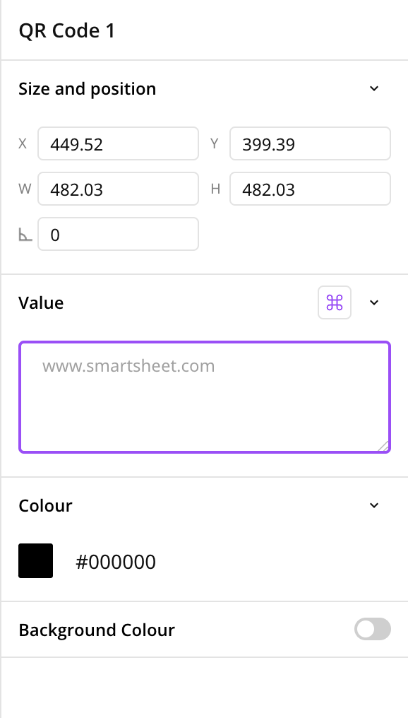
If you want end users to be able to change the QR code at the document level, right-click the QR code placeholder, select Assign value input, select + New input, and then name the input.
Background color
You can apply a background color to the layout by setting the fill color.
Layers/Inputs sidebar
When you add shapes, text, and logos to your layout you will notice them in your layers panel.
Reordering layers
- Drag layers in the panel to reflect the correct order.
- You can also right-select the layer and choose from these four options:
- Send to back
- Send backward
- Bring forward
- Bring to front
Deleting layers
- Delete layers by selecting the object on the layout and hitting the delete/backspace key
- You can also right-selecting on the layer in the layers panel and select Delete.
Grouping layers
- Select the layers you wish to group and press CMD/CTRL + G or right-click on the layers and select Group layers
- To ungroup, select the group and press CMD/CTRL + SHIFT + G or right-click on the layers and select Ungroup layers
Duplicating layers
- To duplicate a layer or a group, select the objects from the canvas or the layer in the layers panel and press CMD/CTRL + D or right-click and select Duplicate
Keyboard shortcuts
- Hold Spacebar to pan the workspace.
- Cmd+Z (Ctrl+Z Windows) to undo, Cmd+Shift+Z to redo (Ctrl+Y Windows).
- Cmd+S (Ctrl+Z Windows) to save.
- Cmd+D (Ctrl+D Windows) to duplicate an object.
- Hold Cmd (Ctrl Windows) and scroll to zoom in and out.
- With a trackpad, pinch/spread to zoom, two-finger to pan.
- Tools shortcuts
- T (Text)
- R (Rectangle)
- O (Circle)
- I (Image)
- P (Pen)
- L (Logo)
- Del to delete an object.
- Cmd+G (Ctrl+G) to group objects, Cmd+Shift+G to ungroup.
- W to show/hide page overflow and print crop/bleed marks (if activated).